Important notice
Our calibration may not meet all calibration requirements for critical packaging machines, be sure to evaluate our calibration process by contacting our engineering group at 800-550-3854. Your machine’s calibration status is a matter of record when leaving our laboratory, the data-logging session represents the “as left” condition of your sealer at the time of calibration. It is possible that a mechanical/physical change, i.e. shipping damage, could change your calibration, therefore, we recommend evaluating your machine’s thermal performance when your sealer returns in order to thwart possible seal failures.
Please contact our engineering group for guidance on appropriate protocols and testing equipment to perform a calibration check at 800- 550-3854. Calibration can be altered if certain parts are changed on the sealer, it is recommended that you always check the thermal performance after service or repair of your sealer. Some of the sealers we calibrate have a wide +/- thermal performance range, therefore when developing your packaging validation you should allow for that range in order to understand the sealers’ possible range of performance after calibration. Because many factors can affect the adherence to the calibration range we always recommend checking calibration throughout the year.
Basic Calibration
Temperature sampled at a single location on the platen at a single set point. A redundant data logging session is performed with a different meter and test lead to verify test accuracy. This includes a certificate, machine affixed sticker with record number, technician’s name, and calibration due date. The line-item data, as well as waveform data, is also included with this calibration package. It is the customer’s responsibility to understand the appropriate calibration needed. We do not assess the value of the “type” of calibration selected to the regulatory process that our customers are bound to.
Basic Plus Calibration
Temperature sampled at a single location on the platen at a single set point. A redundant data logging session is performed with a different meter and test lead to verify test accuracy. If your machine qualifies, we will also perform a mechanical calibration for force and verification of the timer function. This includes a certificate, machine affixed sticker with record number, technician’s name, and calibration due date. The line-item data, as well as waveform data, is also included with this calibration package. It is the customer’s responsibility to understand the appropriate calibration needed. We do not assess the value of the “type” of calibration selected for the regulatory process that our customers are bound to.
Pro Calibration
Temperature sampled at a single location on the platen at multiple set points (up to 3 temperatures), i.e. 220-275-350. A redundant data logging session is performed with a different meter and test lead to verify test accuracy. This includes a certificate, machine affixed sticker with record number, and technician’s name, and calibration due date. The line-item data, as well as waveform data, is also included with this calibration package. It is the customer’s responsibility to understand the appropriate calibration needed. We do not assess the value of the “type” of calibration selected for the regulatory process that our customers are bound to.
Pro Plus Calibration
Temperature sampled at a single location on the platen at multiple set points (up to 3 temperatures), i.e. 220-275-350. A redundant data logging session is performed with a different meter and test lead to verify test accuracy. If your machine qualifies, we will also perform a mechanical calibration for force and verification of the timer function. This includes a certificate, machine affixed sticker with record number, and technician’s name, and calibration due date. The line-item data, as well as waveform data, is also included with this calibration package. It is the customer’s responsibility to understand the appropriate calibration needed. We do not assess the value of the “type” of calibration selected for the regulatory process that our customers are bound to.
Pro Plus Complete
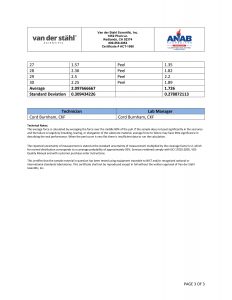
Temperature sampled at a single location on the platen at multiple set points (up to 3 temperatures), i.e. 220-275-350. A redundant data logging session is performed with a different meter and test lead to verify test accuracy. If your machine qualifies, we will also perform a mechanical calibration for force and verification of the timer function. This includes a certificate, machine affixed sticker with record number, and technician’s name, and calibration due date. The line-item data, as well as waveform data, is also included with this calibration package. In addition, we will perform an accredited ASTM F88 peel study on thirty samples of your pouch material as well as an accredited ASTM F1929 dye penetration test on material that qualifies. It is the customer’s responsibility to understand the appropriate calibration needed. We do not assess the value of the “type” of calibration selected for the regulatory process that our customers are bound to.
Accredited Calibration
We provide ISO/IEC 17025 accredited calibration services for customers that request this level of service. By requesting ISO/IEC 17025 accredited calibration services, you agree to the following conditions:
- Calibrations will be performed to the manufacturer’s specifications using the manufacturer’s procedures,
- Calibration intervals will be established to the manufacturer’s recommended service intervals (unless you request otherwise),
- Statements of conformity (e.g. Pass, Fail, In Tolerance, or Out of Tolerance) will be made in accordance with the simple acceptance rule as defined in ILAC-G8:09/2019 section 4.2.1
- Pass/In Tolerance means the measurement result is within the manufacturer’s specifications
- Fail/Out of Tolerance means the measurement result exceeds the manufacturer’s specifications.
- Measurement results found to be out of tolerance will be adjusted (where possible).
If you have questions regarding the scope of this calibration please contact customer service. 800-550-3854
Important information regarding shipping your sealer
Before returning your packaging equipment for service or calibration, please read the following SRA (Service Return Authorization): Third-party shipping organizations such as UPS and Federal Express are accustomed to moving a variety of packages, but oftentimes they disregard fragile labels. The typical handling with these types of carriers is very rough. Within our own shipping department, we have a dock height drop arbiter to determine how well a machine is packed. In other words, if your product were dropped at the height of a commercial truck dock, it should survive the fall unscathed. In order to achieve this robust packaging, you should not use fillers such as loose-filled Styrofoam, as it allows too much movement within the container during the shipping process.
When preparing your sealing equipment for shipment, you should first secure the sealing jaws by carefully placing a foam rubber or corrugated insert in the jaws in order to prevent the jaws from moving during shipment, which can cause a sealing jaw breakage. After securing the jaw, the sealing equipment should be placed in an oversized plastic bag in order to prevent packaging material and particulates from entering the inside of the machine during the shipping process. The bagged machine should be placed in a heavy, preferably double walled, corrugated box with a minimum of six inches of buffer space between the machine and the box walls. This includes the bottom of the box as well. A foam sheet should be placed on the bottom of the box. The sealing machine should be placed in the center and all sides surrounding the machine should also be buffered with multiple layers of corrugated or foam material. Pay special attention to the jaw ends where the electrodes are located. This process should be repeated at the top of the machine. There should be no air space on any of the sides within the box, so the machine cannot move during shipment.
Also, if you are sending any loose parts with the machine, such as cables, etc. do not place them near the machine as they may rub during shipment causing damage. Do not send the machine table (that the pouch rests on when sealing) as this may rub against the machine and cause damage. If you have any specific requests in terms of how the machine should be calibrated or serviced, or a description of the problems the machine is experiencing, those should be included with the documentation. Also, prominently note any safety concerns or specific hazardous conditions of the sealer under the Additional Comments section of the SRA Number Request Form.
A Maintenance Supervisor’s name and phone number should be included. The machine should be strapped with fiber strapping tape or nylon shipping straps and marked excessively with red fragile labels on every exposed panel of the shipping container. Further, the SRA (Service Return Authorization) number should be prominently marked on the face of the box. Also, it has been our experience even when utilizing extreme caution, machine damage can still occur. Therefore, it is vital that you send the equipment insured for the purchase amount of the unit in order to secure your investment. Van der Stahl Scientific Inc. cannot be responsible for any equipment in transit to our facility for service and repair. Please sign this agreement acknowledging that you understand how the equipment should be prepared for safe transit and fax it back to our customer service line at 866-203-0809. Should you have additional questions regarding this service return authorization, please feel free to contact our customer service agents at 800-550-3854.
LIMITED SERVICE WARRANTY TO ORIGINAL PURCHASER
This limited service warranty applies solely to equipment serviced or repaired by Van der Stahl Scientific, Inc. (VDS), and does not include transportation, installation, or removal, or re-installation.
Subject to the limitations herein, VDS warrants that the service or repair of new machinery for one (1) year from the date of purchase, will be free from defects in new materials and workmanship. This limited service warranty excludes: (a) damage which occurs in shipment; (b) applications and uses for which machine was not intended; (c) failures or problems which are caused by products or equipment not supplied by VDS; (d) accidents, misuse, abuse, neglect, misapplication, fire, water, lightning or other acts of nature; (e) incorrect electrical line voltage, fluctuations or surges; (f) damage caused by improper or faulty installation, or any act, error, neglect or default of Customer; (g) improper connection with any peripheral; (h) machine alteration or modification; (i) in1proper or unauthorized repair; (j) cosmetic damage to exterior finish; (k) machines with altered serial numbers; (I) failure to follow operating instructions as covered in the manual, including maintenance and calibration guidelines; (m) normal wear to parts such as heating elements, glass cloth, silicone rubber, temperature sensors, shock absorbers; (n) customer adjustments, maintenance and environmental instructions which are covered and prescribed in the product manual. All warranty work will be performed at the VDS facility.
If such VDS product fails to conform to the warranty above, the exclusive remedy of Customer and the sole liability of VDS shall be, at the option of VDS, to replace or repair the affected product, or to refund to Customer the price of the affected products. The availability of replacement products is subject to product discontinuance policies at VDS. Customers may not return products without first obtaining a customer service return authorization (SRA) number from VDS. If VDS elects to repair the affected product, all warranty work performed on our products will be handled by a VDS Service Technician at the VDS service center in southern California and the amount of time it may take on a service will depend on technician availability due to service load. VDS will repair or replace the machine with new or reconditioned parts.
THE WARRANTIES SET FORTH HEREIN ARE EXCLUSIVE AND IN LIEU OF ALL OTHER WARRANTIES, REMEDIES, AND CONDITIONS, WHETHER ORAL OR WRITTEN, EXPRESS OR IMPLIED. VDS DISCLAIMS ALL OTHER WARRANTIES, WHETHER EXPRESS, IMPLIED OR STATUTORY, INCLUDING, WITHOUT LIMITATION, ANY WARRANTY OF MERCHANTABILITY, FITNESS FOR A PARTICULAR PURPOSE, OR NON-INFRINGEMENT, AND ANY WARRANTY THAT MAY ARISE FROM COURSE OF DEALING, COURSE OF PERFORMANCE, OR USAGE OF TRADE. IF VDS CANNOT LAWFULLY DISCLAIM IMPLIED WARRANTIES UNDER THIS LIMITED PRODUCT WARRANTY, ALL SUCH IMPLIED WARRANTIES, INCLUDING WARRANTIES OF MERCHANTABILITY AND FITNESS FOR A PARTICULAR PURPOSE, ARE LIMITED IN DURATION TO THE WARRANTY PERIOD (AS DEFINED ABOVE). YOUR SOLE REMEDY WITH RESPECT TO ANY BREACH OF THE LIMITED PRODUCT WARRANTY SHALL BE THE REPAIR OR REPLACEMENT OF THE DEVICE AS SPECIFIED IN THE LIMITED PRODUCT WARRANTY. VDS IS NOT RESPONSIBLE FOR DIRECT, SPECIAL, INCIDENTAL, OR CONSEQUENTIAL DAMAGES RESULTING FROM ANY BREACH OF WARRANTY OR UNDER ANY OTHER LEGAL THEORY INCLUDING, BUT NOT LIMITED TO, LOST PROFITS, DOWNTIME, GOODWILL, DAMAGE TO, OR REPLACEMENT OF EQUIPMENT AND PROPERTY, AND ANY COSTS OF RECOVERING, REPROGRAMMING, OR REPRODUCING ANY PROGRAM OR DATA STORED IN OR USED WITH A SYSTEM. THIS LIMITED WARRANTY SHALL NOT EXTEND TO ANYONE OTHER THAN THE ORIGINAL PURCHASER OF IS PRODUCT, IS NONTRANSFERABLE, AND STATES YOUR EXCLUSIVE REMEDY.
Some states do not allow the exclusion or limitation of incidental or consequential damages or exclusions or limitations on the duration of implied warranties or conditions, so the above limitations or exclusions may not apply to you. This limited warranty gives you specific legal rights, and you may also have other legal rights, which vary from state to state. VDS makes no claims that our medical device packaging equipment meets the requirements of all medical device manufacturers’ validations. Medical device packaging validation varies greatly depending on the risk policy of the medical device manufacturer as well as the class of medical device. It’s important that our customers understand all of our packaging machine functionality in terms of accuracy of the sealer, machine alarms, as well as other negative machines, attributes that might affect your medical device packaging validation. It is the customer’s responsibility to maintain the equipment in order for the machine to develop expected performance.
Due to the wide range of packaging materials and throughput, it is impossible to develop a generic recommended preventative maintenance plan. It is the customer’s responsibility to develop a preventative maintenance plan based on machine settings and throughput. It is the customer’s responsibility to calibrate the machinery, our firm does not send out reminders or notifications regarding calibration m maintenance. VDS does not perform validations for our customers as it is beyond the scope of our function as a machine provider. The process of medical device packaging validation is complicated and should be performed by quality or manufacturing engineers that understand the installation qualification process before purchasing packaging equipment.